| View previous topic :: View next topic |
| Author |
Message |
GuitarHailz 


Joined: 11 Jun 2007
Posts: 4910
Location: Austin, Texas
|
 Posted: Mon Dec 03, 2007 1:52 pm Post subject: Posted: Mon Dec 03, 2007 1:52 pm Post subject: |
 |
|
This is awesome, and I love my new sig.  Appreciate it you guys!! Appreciate it you guys!!
I donated $10 more today and bought the upgrade to 4 games with my points. You say in your post that only 3 work at the moment.. but I'm assuming at some point I'll be able to put 4 in my sig? Or will I have to pay again?
EDIT: Nevermind, actually read through the thread better lol. Sounds cool, can't wait!! Even if (right now) it is "wasted" points.. I still have a sexy green star by my name. 
EDIT2: Suggestion: From a visual standpoint, the sigs look really nice. If I were to make a suggestion though about style 4, it would be a nice touch if GH2 or GH1 (either one) were a different color from each other. I like that you can now recognize the game simply by the color of the sig:
Green- GH2-360
Purple- GH80s
Yellow (or Orange..)- GH3
But GH2 and GH1 are both red. If I were to make a suggestion, I think GH1 or GH2-PS2 should be a blue color (or something else.. but blue is the only color that hasn't been used, since both yellow and orange would look too much like GH3) and the other one can stay red, just to help people visually distinguish the way they can with the other games. That would look better IMO anyway.
Still, amazing job with these guys.
_________________
|
|
| Back to top |
|
 |
Deimos


Joined: 24 Jul 2007
Posts: 1344
Location: Calgary, AB
|
| Posted: Mon Dec 03, 2007 4:50 pm Post subject: |
|
|
First thing to note, I fixed a bug this morning that had slipped past. If you chose style 4, and only one game, your name and the ScoreHero URL would overlap, simply due to the image not being wide enough to fit both. I've now moved the URL to the top right corner if you only choose one game, so if you selected style 4 with only one game and then changed to something else when you realized it looked messed up, feel free to change it back, it will be fine now.
| GuitarHailz wrote: | | But GH2 and GH1 are both red. If I were to make a suggestion, I think GH1 or GH2-PS2 should be a blue color (or something else.. but blue is the only color that hasn't been used, since both yellow and orange would look too much like GH3) |
I agree that it would be nice to be able to visually distinguish them more easily, however I'm not really sure what the best way to do this would be. I don't think making the GH2 image blue makes much sense, as the color schemes for the rest of the images are taken from the games they represent. Actually, I guess the GH2-360 one is green, and that game's color scheme was white and black, so we already have an exception, but green is pretty clearly the 360 color. Either way, both GH1 and GH2 used a red and black color scheme, and I don't really know what other color could be considered to represent one of those games. I may play around with it a bit, but if anyone wants to come up with a concept image, I'd certainly be happy to use it if it looks good.
_________________
|
|
| Back to top |
|
|
TheHammer417


Joined: 01 Sep 2007
Posts: 2178
Location: Chicago, IL
|
| Posted: Mon Dec 03, 2007 5:19 pm Post subject: |
|
|
yay ive been waiting for the 80's and GH3 ones 
_________________
|
|
| Back to top |
|
|
GuitarHailz
Joined: 11 Jun 2007
Posts: 4910
Location: Austin, Texas
|
| Posted: Mon Dec 03, 2007 6:18 pm Post subject: |
|
|
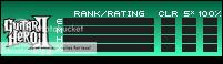
Just playing around a bit myself.
Here is a lighter color for GH1:

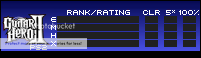
Here is a slightly darker, almost maroon color for GH2:
I'll put them next to each other so you can see the difference.
It's subtle, yes, and naturally I'm probably the only person in the world who will care, but I like it a lot.
Sorry to be nit-picky. This is just a concept too.. feel free to play with it as you like. Just thought I'd throw this out there.
_________________
|
|
| Back to top |
|
|
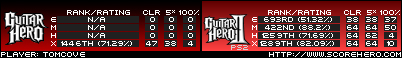
Tomcove 

Joined: 02 Feb 2007
Posts: 340
Location: USS Moisthero
|
|
| Back to top |
|
|
sentimentalgeek

Joined: 09 Aug 2007
Posts: 1075
Location: Seattle, WA
|
| Posted: Mon Dec 03, 2007 6:34 pm Post subject: |
|
|
I care too! I'd love for GH1 and GH2 for the PS2 to be distinguishable from each other. I like Hailz's idea of GH2 being darker. Or heck, since the game colors were red and black, you could always make GH2 black. Maybe it would be a bit much because the text boxes are already a charcoal-ish color, but I'd prefer that the two color schemes be different in some way.
_________________
|
|
| Back to top |
|
|
Murderkill

Joined: 25 Apr 2007
Posts: 295
|
| Posted: Mon Dec 03, 2007 7:02 pm Post subject: |
|
|
Excellent, thanks for the update. Looks like I'll have to try to narrow down the cutoff range on some GH3 songs or donate so I can get GH80's into my sig.
_________________
|
|
| Back to top |
|
|
topher07

Joined: 06 Aug 2007
Posts: 352
|
|
| Back to top |
|
|
Kerfoot32


Joined: 22 Jun 2007
Posts: 914
Location: Kentucky
|
|
| Back to top |
|
|
bballcenter7

Joined: 09 Jul 2007
Posts: 1313
Location: in IN
|
| Posted: Tue Dec 04, 2007 2:49 am Post subject: |
|
|
| GuitarHailz wrote: | | But GH2 and GH1 are both red. If I were to make a suggestion, I think GH1 or GH2-PS2 should be a blue color (or something else.. but blue is the only color that hasn't been used, since both yellow and orange would look too much like GH3) and the other one can stay red, just to help people visually distinguish the way they can with the other games. That would look better IMO anyway. |
I agree with Hailz, I think a different color for GHI or II is a good idea, just to help make the distinction between the two games, and to make the scores seem less lopsided when placed next to each other. Blue sounds like the best choice to me, but black would also be cool. just putting this out there 
_________________
|
|
| Back to top |
|
|
GuitarHailz
Joined: 11 Jun 2007
Posts: 4910
Location: Austin, Texas
|
| Posted: Tue Dec 04, 2007 8:39 am Post subject: |
|
|
| sentimentalgeek wrote: | | Or heck, since the game colors were red and black, you could always make GH2 black. Maybe it would be a bit much because the text boxes are already a charcoal-ish color, but I'd prefer that the two color schemes be different in some way. |
| bballcenter7 wrote: | | Blue sounds like the best choice to me, but black would also be cool. just putting this out there |
I've been experimenting a lot, and black with the charcoal color for the scores doesn't look very good. I think the different shades of red as I made in my previous post looks the best.
Blue looks good, but as Deimos said, it doesn't fit with the color scheme of the game. Same goes with 360, but Green is very distinguishably the 360 color. Lets get a few more opinions on this.
I'll post the black versions if you want them to look at. But for now I'd like some opinions on the stuff I've already posted.
_________________
|
|
| Back to top |
|
|
CrackerRiley
Joined: 23 Mar 2006
Posts: 3085
|
| Posted: Tue Dec 04, 2007 2:13 pm Post subject: |
|
|
| IMO, the different shades of red aren't that great. I think if we are trying to distinguish the games even more they shouldn't just be made a slightly different shade... |
|
| Back to top |
|
|
GuitarHailz
Joined: 11 Jun 2007
Posts: 4910
Location: Austin, Texas
|
| Posted: Tue Dec 04, 2007 2:31 pm Post subject: |
|
|
| CrackerRiley wrote: | | IMO, the different shades of red aren't that great. I think if we are trying to distinguish the games even more they shouldn't just be made a slightly different shade... |
I agree that its not ideal, but until I (or anyone else) get anymore bright ideas, this is the best that I can come up with. I would be all for something else and definitely open to suggestions.
Here are some of what I've come up with:
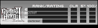
I only made the GH2 version but of course any of these concepts can easily be applied to the GH1 sig image. I just didn't want to make 2 of everything obviously unless somebody thinks they might want GH1 in one of these colors.
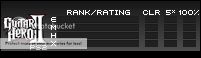
I like how the black one looks now. Before when I was experimenting I made it a solid black, but I think it looks really nice with the gradient. I also think the silver looks good too (though it reminds me more fo the XBOX version since the box is silver/white on that game). It makes sense as well since there are both black and silver PS2s. Blue does make sense too in a way.. the first image reminds me of the color of star power, and the 2nd image reminds me of the blue letters that "PS2" are written in on the box and such.
EDIT!
Actually, it makes a TON of sense to make the GH1 image black, and the GH2 image red, that way, the games will match their SG's. Who do you guys think?
_________________
|
|
| Back to top |
|
|
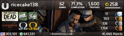
ricecake 

Joined: 17 May 2007
Posts: 1890
Location: Linthicum Heights, MD
|
| Posted: Tue Dec 04, 2007 9:50 pm Post subject: |
|
|
| GuitarHailz wrote: |
Blue does make sense too in a way.. [...] reminds me of the blue letters that "PS2" are written in on the box and such. |
I like this blue one the best.
| GuitarHailz wrote: | | Actually, it makes a TON of sense to make the GH1 image black, and the GH2 image red, that way, the games will match their SG's. Who do you guys think? |
Actually, I think that is a fantastic idea as well.
_________________
|
|
| Back to top |
|
|
Sully

Joined: 12 Nov 2006
Posts: 4570
Location: Tampa, FL
|
| Posted: Wed Dec 05, 2007 12:17 am Post subject: |
|
|
| GuitarHailz wrote: |
Actually, it makes a TON of sense to make the GH1 image black, and the GH2 image red, that way, the games will match their SG's. Who do you guys think? |
This is a great idea. I wasn't into adjusting the colors initially, but this does make sense. |
|
| Back to top |
|
|
|
|
You cannot post new topics in this forum
You cannot reply to topics in this forum
You cannot edit your posts in this forum
You cannot delete your posts in this forum
You cannot vote in polls in this forum
|
Copyright © 2006-2024 ScoreHero, LLC
|
Powered by phpBB
|