| View previous topic :: View next topic |
| Author |
Message |
BrianBAM19 


Joined: 05 May 2007
Posts: 2804
Location: San Antonio, Texas
|
 Posted: Wed Dec 05, 2007 1:07 am Post subject: Posted: Wed Dec 05, 2007 1:07 am Post subject: |
 |
|
| GuitarHailz wrote: | 
Actually, it makes a TON of sense to make the GH1 image black, and the GH2 image red, that way, the games will match their SG's. Who do you guys think? |
That's a clever idea. I like it, and it does make a lot of sense. It would be nice to have all of the game images different colors, instead of having both GHI and GHII(PS2) red.
_________________

| KoE wrote: | | <KoE> she wanted to put the BAM in brianbam. |
|
|
| Back to top |
|
 |
Deimos 


Joined: 24 Jul 2007
Posts: 1344
Location: Calgary, AB
|
| Posted: Wed Dec 05, 2007 6:09 am Post subject: |
|
|
I think the totally black/grey one looks a little too "grayscale" (because it is, I guess). Here's a concept I was playing with. The gradient is reversed, and more to the "black side" than the red, what do you think? I did this to the GH2-PS2 image, but it should probably actually be the GH1 image that gets done this way, since as Hailz said, it would match the SGs.
Placed beside the regular GH2 version for easy comparison, since if someone uses GH1 and GH2 in their sig they'll be put side-by-side like this.
 
_________________
|
|
| Back to top |
|
|
ricecake 

Joined: 17 May 2007
Posts: 1890
Location: Linthicum Heights, MD
|
| Posted: Wed Dec 05, 2007 7:16 am Post subject: |
|
|
| Deimos wrote: | I think the totally black/grey one looks a little too "grayscale" (because it is, I guess). Here's a concept I was playing with. The gradient is reversed, and more to the "black side" than the red, what do you think?
|
To be totally honest, in my personal opinion... I find GuitarHailz's black one to be more aesthetically pleasing. Of course, I mean no disrespect at all toward you or the hard work you do for this site!
_________________
|
|
| Back to top |
|
|
GuitarHailz


Joined: 11 Jun 2007
Posts: 4910
Location: Austin, Texas
|
| Posted: Wed Dec 05, 2007 9:31 am Post subject: |
|
|
| Deimos wrote: | I think the totally black/grey one looks a little too "grayscale" (because it is, I guess). Here's a concept I was playing with. The gradient is reversed, and more to the "black side" than the red, what do you think? I did this to the GH2-PS2 image, but it should probably actually be the GH1 image that gets done this way, since as Hailz said, it would match the SGs.
Placed beside the regular GH2 version for easy comparison, since if someone uses GH1 and GH2 in their sig they'll be put side-by-side like this.
|
To be honest I had the same idea at first, about just switching the gradients. I even tried it myself when I was playing around yesterday.
The sig by itself looks awesome, but the only problem is that when you put it next to the others it sticks out like a sore thumb because the gradient moves in the opposite direction. Its good to play around though and see what people like and what works.
If necessary we could even make a poll thread so people can vote on what sig image they would prefer, since after all it's the SH population who would be using it. *shrug*
Here is the black Guitar Hero 1 image I made today:

This is what a full sig would look like:
  
Thoughts? Opinions?
Thanks, Deimos, for your help. 
_________________
|
|
| Back to top |
|
|
sentimentalgeek

Joined: 09 Aug 2007
Posts: 1075
Location: Seattle, WA
|
| Posted: Wed Dec 05, 2007 10:31 am Post subject: |
|
|
Yeah, I really like the look of the black gradient one! That's fantastic, and I also like the idea of having the colors of the games match the colors of the SGs.
I'd actually thought about the reversed gradient idea too, but then I realized that it only really distinguishes them if they're next to each other. If you're the type of person who's only displaying one of them, it would still be hard to look at a glance and tell whether it's I or II, because the basic color scheme is the same.
Personally I think we might want to stay away from using the color blue until it's been determined what the Rock Band ones are going to look like, because the packaging for that game is VERY blue. I guess when more games come out we're inevitably going to run out of colors at some point so we're just postponing the inevitable, but for now, this is fun.
_________________
|
|
| Back to top |
|
|
GuitarHailz
Joined: 11 Jun 2007
Posts: 4910
Location: Austin, Texas
|
| Posted: Wed Dec 05, 2007 10:59 am Post subject: |
|
|
| sentimentalgeek wrote: | Yeah, I really like the look of the black gradient one! That's fantastic, and I also like the idea of having the colors of the games match the colors of the SGs.
I'd actually thought about the reversed gradient idea too, but then I realized that it only really distinguishes them if they're next to each other. If you're the type of person who's only displaying one of them, it would still be hard to look at a glance and tell whether it's I or II, because the basic color scheme is the same.
Personally I think we might want to stay away from using the color blue until it's been determined what the Rock Band ones are going to look like, because the packaging for that game is VERY blue. I guess when more games come out we're inevitably going to run out of colors at some point so we're just postponing the inevitable, but for now, this is fun. |
Ahhhh yeah, good point about the Rock Band thing. I just made the blue images for fun to see how they would look. Lets see what others think about the stuff me and Deimos made, and get some other opinions on the subject.
I'm going to be gone in Italy for the next 2 weeks roughly, so anyone feel free to pick apart what I've made or use it. You've got my permission now, since I won't be online for some time to give it later.
_________________
|
|
| Back to top |
|
|
MetalMadness 
Joined: 11 May 2006
Posts: 1095
|
| Posted: Wed Dec 05, 2007 1:17 pm Post subject: |
|
|
Black for GHI, Red for GHII matching their SG's - FTW!
_________________
|
|
| Back to top |
|
|
pk217doc


Joined: 08 Nov 2006
Posts: 145
|
| Posted: Wed Dec 05, 2007 3:27 pm Post subject: Black or Red gradients... |
|
|
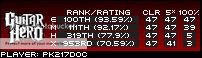
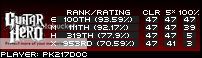
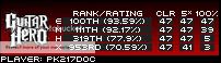
Honestly, IMO, I think the black/gray gradient or the reversed red/black gradient would look fine either way. The black one stands out more and would be more distinguishable, but then again, the reversed red is really obvious as well (even by itself). The reason I say this is because to me the "Guitar Hero" in the Guitar Hero vs Guitar Hero II images completely changes the way each sig image looks.
I would really like it if either Deimos or Hailz (or anyone for that matter) would take each of the 2 suggested ones and put some stats in the images and have the legit "Guitar Hero" wording on each example. I've seen the black one with the correct wording but no stats, and I've seen the reverse red with stats while still having the GHII wording. So personally, I would just like to see both with the correct wording and stats to see how they each would look in a final cut version.
Nice work people.
_________________


| Alakaiser wrote: | | They should be around some time between now and when they're up. |
|
|
| Back to top |
|
|
GuitarHailz
Joined: 11 Jun 2007
Posts: 4910
Location: Austin, Texas
|
| Posted: Wed Dec 05, 2007 3:44 pm Post subject: Re: Black or Red gradients... |
|
|
| pk217doc wrote: | I would really like it if either Deimos or Hailz (or anyone for that matter) would take each of the 2 suggested ones and put some stats in the images and have the legit "Guitar Hero" wording on each example. I've seen the black one with the correct wording but no stats, and I've seen the reverse red with stats while still having the GHII wording. So personally, I would just like to see both with the correct wording and stats to see how they each would look in a final cut version.
Nice work people. |
Here's hoping I didn't misunderstand somehow. Hope this works.
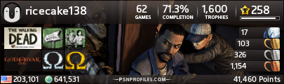
I used my stat image as an example, so enjoy looking at my mediocre points:


lol wut *Hailz realizes that she somehow has 6 Expert FCs and 1 Hard FC on GH2.. must update when she gets to America*
_________________
Last edited by GuitarHailz on Wed Dec 05, 2007 3:45 pm; edited 1 time in total |
|
| Back to top |
|
|
Deimos
Joined: 24 Jul 2007
Posts: 1344
Location: Calgary, AB
|
| Posted: Wed Dec 05, 2007 3:45 pm Post subject: |
|
|
| ricecake wrote: | | To be totally honest, in my personal opinion... I find GuitarHailz's black one to be more aesthetically pleasing. Of course, I mean no disrespect at all toward you or the hard work you do for this site! |
Haha you don't have to be so gentle towards me, I'm not a delicate flower, and it's not like I spent a week carefully crafting that image. I just wanted to see if that was a possible option. From speaking to the other mods about it, I don't think mine is a particularly good option because of the reverse gradient. It makes it look as though the GH1 image is coming "out" of the page, and the others are going "in".
However, my main problem with the black GH1 image is just that it looks too... drab compared to the others. Especially imagine someone that only uses 1 game in their sig with just the GH1 one, it would be totally grayscale. I think I'd like at least some color in it somehow, possibly making the outline around "Guitar Hero" red.
I do definitely think it's a good idea to have them each an easily distinguishable color, and that black is probably the best candidate for GH1, but I just don't want to make the GH1 one appear inferior by being grayscale while the others all have nice colors.
_________________
|
|
| Back to top |
|
|
GuitarHailz
Joined: 11 Jun 2007
Posts: 4910
Location: Austin, Texas
|
| Posted: Wed Dec 05, 2007 3:53 pm Post subject: |
|
|
| Deimos wrote: | | ricecake wrote: | | To be totally honest, in my personal opinion... I find GuitarHailz's black one to be more aesthetically pleasing. Of course, I mean no disrespect at all toward you or the hard work you do for this site! |
Haha you don't have to be so gentle towards me, I'm not a delicate flower, and it's not like I spent a week carefully crafting that image. I just wanted to see if that was a possible option. From speaking to the other mods about it, I don't think mine is a particularly good option because of the reverse gradient. It makes it look as though the GH1 image is coming "out" of the page, and the others are going "in".
However, my main problem with the black GH1 image is just that it looks too... drab compared to the others. Especially imagine someone that only uses 1 game in their sig with just the GH1 one, it would be totally grayscale. I think I'd like at least some color in it somehow, possibly making the outline around "Guitar Hero" red.
I do definitely think it's a good idea to have them each an easily distinguishable color, and that black is probably the best candidate for GH1, but I just don't want to make the GH1 one appear inferior by being grayscale while the others all have nice colors. |
I understand where you're coming from, and if you'd like for me to experiment some more I will.
To be honest, I would be willing to bet that 90% of the people here won't see black as an inferior color. I mean, the people here listen to things like Dragonforce, Megadeth, Metallica, Black Sabbath, etc etc. If anything, black will be "teh shit!!" color to have. Thats just my opinion anyway.
I'll try the red outline idea. But I think anything "special" that we try to do to the GHI image will make it stick out, and then we'll have the opposite problem. You know? Hmm..
_________________
|
|
| Back to top |
|
|
trixo


Joined: 28 Aug 2007
Posts: 372
Location: charleston sc
|
|
| Back to top |
|
|
pata70

Joined: 23 Mar 2007
Posts: 426
Location: Canada
|
|
| Back to top |
|
|
pk217doc
Joined: 08 Nov 2006
Posts: 145
|
| Posted: Wed Dec 05, 2007 6:49 pm Post subject: |
|
|
Here is something I tried to do real quick just to get an idea of how that might look on the GH1 portion of your comment. Couple of examples...
_________________
| Alakaiser wrote: | | They should be around some time between now and when they're up. |
|
|
| Back to top |
|
|
pk217doc
Joined: 08 Nov 2006
Posts: 145
|
| Posted: Wed Dec 05, 2007 6:56 pm Post subject: One More... |
|
|
Here is one more possibility.
I will also put these next to the other sig images in a lil bit.
_________________
| Alakaiser wrote: | | They should be around some time between now and when they're up. |
|
|
| Back to top |
|
|
|
|
You cannot post new topics in this forum
You cannot reply to topics in this forum
You cannot edit your posts in this forum
You cannot delete your posts in this forum
You cannot vote in polls in this forum
|
Copyright © 2006-2024 ScoreHero, LLC
|
Powered by phpBB
|