| View previous topic :: View next topic |
| Author |
Message |
ZackaryCF

Joined: 11 Mar 2008
Posts: 899
Location: West Mitten
|
 Posted: Sun Aug 30, 2009 8:57 pm Post subject: Getting a tattoo, need some creativity... Posted: Sun Aug 30, 2009 8:57 pm Post subject: Getting a tattoo, need some creativity... |
 |
|
Alright, I'm getting a tattoo next saturday. I'm getting what most people would recognize as the "Tool eye."
I don't want it in full color, and I don't want it all black, so I'm getting this: http://media.cellfish.com/public/9/4/9/231949/420.jpg and then I'm going to use the color scheme from this one: http://media.photobucket.com/image/tool%20eye/crowrg82/tool_eye1.bmp for the iris, like yellow, green, blue and purple rings around the pupil.
Also, I'm want the text "Prying open my third eye" somehow involved (in this font: http://www.dafont.com/font.php?file=capitalis_goreanis&page=1&nb_ppp_old=10&text=Prying+Open+My+Third+Eye&nb_ppp=10&psize=s&classt=alpha).
Basically, my problem, and the point of this thread, is that I don't know how to include the text. I don't want it like "in" the image, but I'm getting this tattoo on my inner forearm, so theres no room to really write it anywhere...so I was thinking of getting the eye on one arm and doing the text vertically up my arm from wrist to elbow on the other arm...but I'm just not sure...
Another idea I had was having the text go around the eye in a circle, but I think it's too much text for it to look good without being too small or scrunched...
So I'm pretty much just asking for creative ideas of ways to somehow integrate the text.
Thanks in advance to anyone able to help me out with this. |
|
| Back to top |
|
 |
Rickles


Joined: 05 Jun 2007
Posts: 1441
Location: The people in white coats won't tell me!
|
| Posted: Sun Aug 30, 2009 9:29 pm Post subject: |
|
|
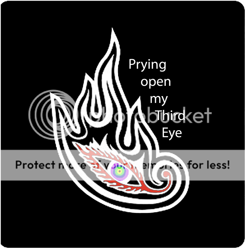
I'll be glad to help decide what your arm looks like for the rest of your life...
At first I thought, Ehh tattoo. Then I read it's the tool eye and I thought, "Hell yeah that's sick..."
Here is my rendition. Anything you want to change?
_________________
|
|
| Back to top |
|
|
guitarroker
Joined: 06 Jan 2008
Posts: 1993
Location: Iceland
|
| Posted: Sun Aug 30, 2009 9:40 pm Post subject: |
|
|
That's ingenious, Rickles. Space efficient and stylish. It would look incredible with the Capitalis Goreanis font.


_________________
|
|
| Back to top |
|
|
Rickles
Joined: 05 Jun 2007
Posts: 1441
Location: The people in white coats won't tell me!
|
|
| Back to top |
|
|
|
|
You cannot post new topics in this forum
You cannot reply to topics in this forum
You cannot edit your posts in this forum
You cannot delete your posts in this forum
You cannot vote in polls in this forum
|
Copyright © 2006-2024 ScoreHero, LLC
|
Powered by phpBB
|